Just wanted to say a huge thanks to our illustrious leader, Andy - your efforts with the site are really appreciated!
Looks great, loads of new features and very slick! Top marks!
Just wanted to say a huge thanks to our illustrious leader, Andy - your efforts with the site are really appreciated!
Looks great, loads of new features and very slick! Top marks!
More than welcome @matt447
Splendid effort Andy ![]()
Cheers Paul. Coming from a fellow dev / site runner that means a lot
![]()
Agreed, well done Andy.
Anyone think we are missing anything? Want anything else? Have I overlooked something?
I’ve been out of touch for bit while on Euro tour. Currently looking at new site on iPhone so struggling a bit but I’m sure I’ll get the hang of it
Let me know if I can assist @thommo
Everything should be where you left it before but happy to guide anyone through!
Thanks, Andy. Can’t seem to find my pre-Euro topic so that I can add pics🙄
This one @thommo ?
Must say, I’ve had a lot of fun finding and re-reading old topics on the forum since it’s upgrade - for some reason it seems easier to locate and browse these things?
One thing I did notice as a side-effect though, is that scrolling through long topics on my phone, I quite often accidentally ‘reacted’ to the posts - must remember to move my thumb sideways a little to avoid the hit area for the reaction button, lol!
Anyway, great work Andy, forum is working wonderfully! ![]()
Appreciate the feedback @matt447. I hope other users feel the same!
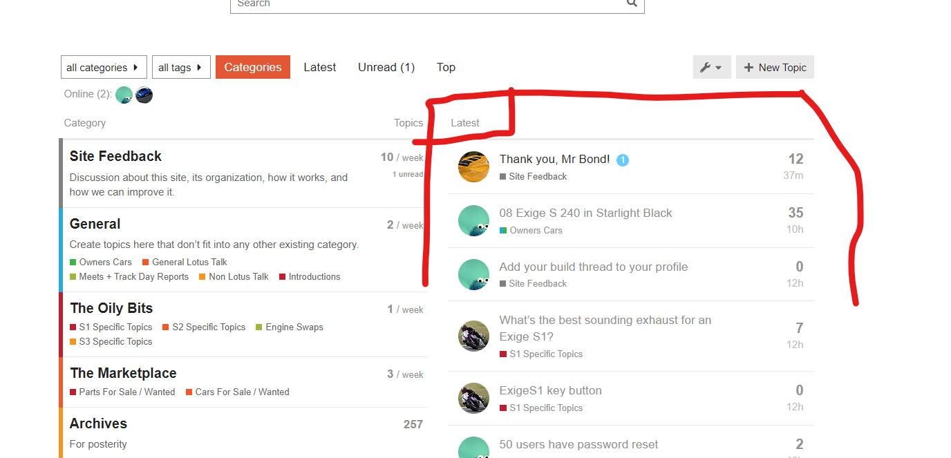
Looks great @andybond - one thing I liked about the previous design was that it was really easy to see unread topics - with the new design, is it just stuff that is bold ? or is there a better view I should use
In short - yes. bold means unread. Let me see if I can adjust that weight a little.
Your home page shows the latest, either read or not.
You can switch to unread
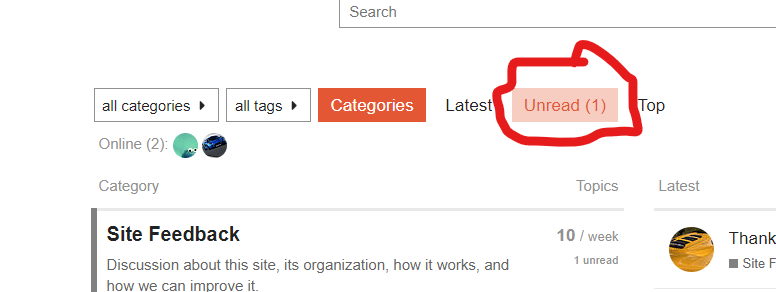
but ultimately if you go into the categories its bold an unbold
I’ve been tweaking my views/layouts a bit. I keep saying that I’m a phpbb dinosaur and that’s still true, I found the new forum to be a bit of a sensory overload at first but now that I’m “learning it” a bit, the modern functionality is shining through and it’s a much more usable experience.
Switching my default view to “Latest” rather than “Categories” I think works well for a relatively low volume forum like Exiges. Any other tips/tricks from others?
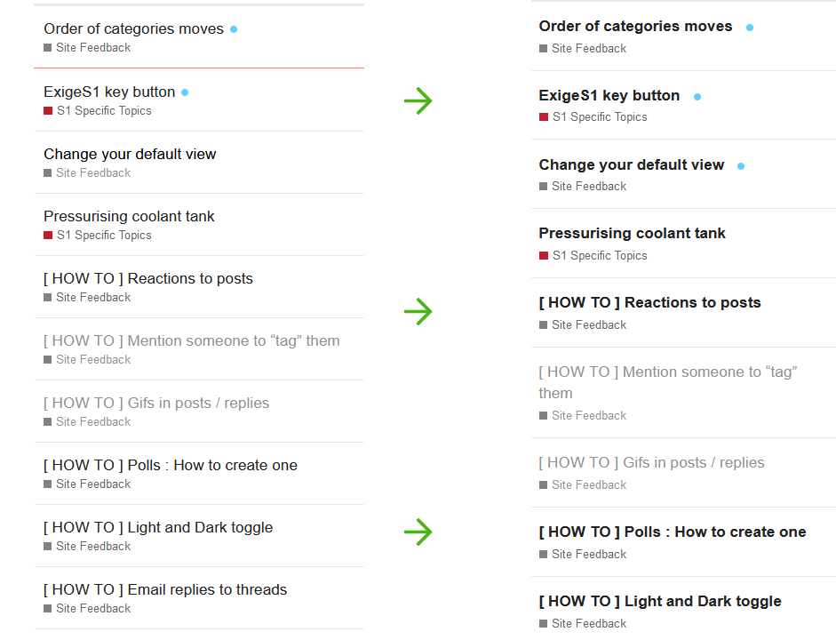
Not toe-treading here, just an observation based on what @The_Hornet said about bold. I dunno what the built-in stuff lets you do but I think this is doable with a class. All I’ve done is make an unvisited link go more bold - downside is you lose a bit of space but it stands out a bit better. Shame there’s no ‘visited’ class for the whole section allowing more control (I say this without looking to check!).
[Edit after posting] Bloody nora it allows pasting images from the clipboard. ![]()
![]()
No toe treading at all.
I try and steer clear of css mods because invariably something will change between build and knacker it at a later time.
I am taking a look through the inbuilt stuff to see if it can be achieved.
Clipboard stuff is quite trick.
I think this should help @The_Hornet @PaulT
Brilliant, lovely work Mr Bond! (Prefer forums to Facebook)
Loved the yearly update. Well done, and thanks again